A matrix aggregates data (such as SALES) along two or more dimensions (such as PRODUCT and SALESPERSON) and displays the results in a grid format. Matrices are similar to PivotTables in Excel, and crosstabs in Access.
Got a database? Use Visual DB database form builder to build data entry forms.
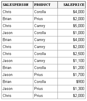
Consider the following datasource. For each transaction that occured at a car dealership, details such as the sales person that sold the car, the product that was sold, and the sale price have been recorded. You want to create a report that easily answers questions such as: What is the total saleprice of all Corollas sold? What is the total saleprice of Camrys sold by Chris?
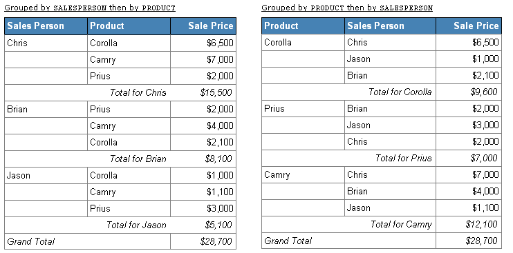
You can use a table with groupings to display summarized data. The first table shown below has been grouped by SALESPERSON first and then by PRODUCT. In this table it is easy to compare products for a given salesperson. However it is not easy to compare salespersons for a given product. Also it does not answer questions such as, what is the total sales for all Camrys?
Alternatively, you can group by PRODUCT first and then by SALESPERSON, as seen in the second table below. In this case it is easy to compare salespersons for a given product, but it is not easy to compare products for a given salesperson. Also, it does not answer questions such as, what is the total sales for all products sold by Chris?
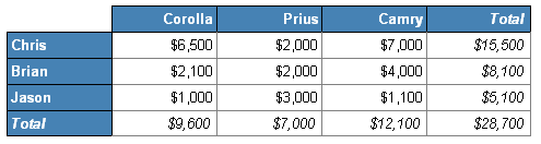
The matrix show below is more compact than either of the tables above, and yet contains all of the information in the two tables above. It is easy to compare products for a given salesperson. It is also easy to compare salespersons for a given product. Totals are available by product and by salesperson.
Notice the following about the matrix above:
Column labels of the matrix are not known at design time. They are unique values of the PRODUCT field, and are obtained at runtime. Similarly, row labels are unique values of the SALESPERSON field.
Number of columns is not known at design time. There are as many columns as there are unique values in the PRODUCT field. Similarly there are as many rows as there are unique values in the SALESPERSON field.
In order to create a matrix report, your datasource should have at least two fields that contain repeating values (for example, PRODUCT and SALESPERSON), and a third, numerical field (for example, SALES) that you want to aggregate for each combination of the first two fields.
At runtime, unique values from the first two fields are displayed as row labels and column labels of the matrix. Thus, for example, unique values of the PRODUCT field are displayed as column labels, and unique values of the SALESPERSON field are displayed as row labels.
Then as each record in your datasource is processed, the values of PRODUCT and SALESPERSON fields of the record are matched up with the column and row labels of the matrix, and the value of the SALES field is added to whatever number is in the cell at the intersection of the corresponding column and row.
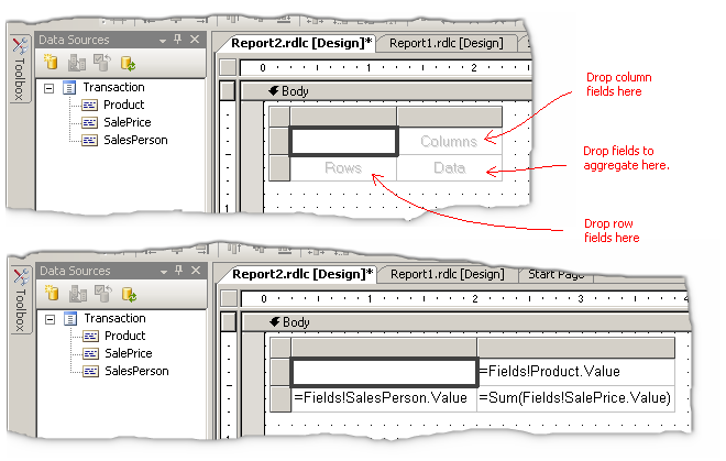
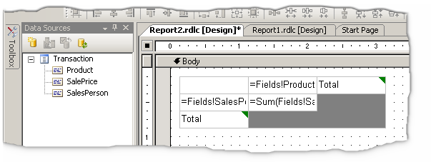
Adding a matrix to your report is easy once you understand what a matrix is and how it works. From the Toolbox drag and drop the Matrix icon to your report. From the Data Sources window, drag and drop the field that will supply the column labels to the cell marked "Columns". Drag and drop the field that will supply the row labels to the cell marked "Rows". Drag and drop the field that should be aggregated to the cell marked "Data". Notice that the field expression is automatically wrapped in a Sum() function when dropped in the "Data" cell. If you would like to see the average sale price instead of the total sale price you can change this to the Avg() function instead. That's it! You can now run the report.
To display totals, right-click on the "Rows" cell or the "Columns" cell (or both) and select Subtotal from the context menu.
Notice the little green triangles? They are used for formatting the numerical value of the total as opposed to the "Total" label. Clicking on the triangle makes the Properties panel display the properties of the numerical value.
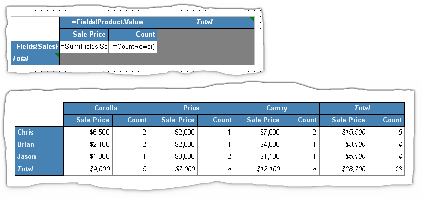
In our matrix it would be nice to show how many units of each product were sold by each sales person, in addition to the aggregate sales price. Here's how you can do that:
Right-click in the "Data" cell and choose "Add Column" from the context menu. A new data cell is added to the matrix. In the new data cell enter an expression for aggregating a field. In our case we want to show how many units of each product were sold by each sales person, so we want to display a count of how many rows exist corresponding to a given product and a given salesman. You can do this by taking advantage of the CountRows() function, so the expression to enter is =CountRows(). In the header corresponding to the new data cell enter the label "Count".
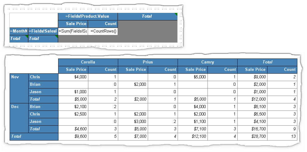
Matrices are not limited to one dimension along columns and one dimension along rows. In the above matrix, assuming the transaction date is available, we may want to group data by month. You can do this as follows:
Right-click on the "Rows" cell and select "Insert Group" from the context menu. The Grouping and Sorting Properties dialog opens. In the Group on Expression list enter the following expression: =MonthName(Fields!Date.Value.Month, true) and close the dialog. A new "Rows" cell is inserted. (Tip: You can re-order rows cells by clicking in the cell and then dragging the gray edge of the textbox.) Then right-click in the cell and select "Subtotal" from the context menu.
Download an app that contains all the samples on this page.