To add a chart to your report drag and drop the chart icon from the toolbox to your report. When you click on the chart on the design surface drop areas appear. Drop areas also appear as you drag fields over the chart. Drag and drop your category fields to the corresponding drop area and your value fields to the data drop area.
Download basic bar chart sample.
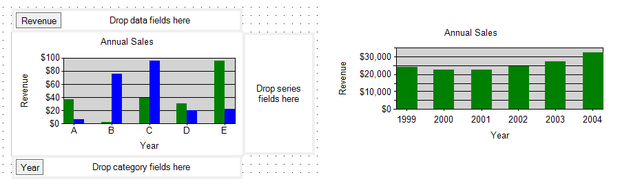
In this example we have two fields, Year and Revenue. The Year field was dropped to the category fields area and the Revenue field was dropped to the data fields area. The series fields area was left empty.
Open the Chart Properties dialog to specify titles, turn off the legend, and to set other properties. The Data tab in this dialog specifies data for the chart. As you drag and drop fields to the chart on the design surface this tab is automatically populated.
In the Data tab pressing the Edit button next to Value fields list opens the Edit Chart Value dialog. In this dialog notice that the field you dropped to the data area is wrapped in a Sum() function. If your category field has unique values as in our sample app, then the fact that the field is wrapped in a Sum() function makes no difference—it is just a sum of a single value. If your category field has repeating data then the chart will group data by the category field, sum up the values for each group, and display the result on the value axis. This ability to summarize data is similar to matrix report item, and is an important feature of charts in ReportViewer. Excel users may recognize that charts in ReportViewer are similar to Pivot Charts in Excel as opposed to regular Excel charts.
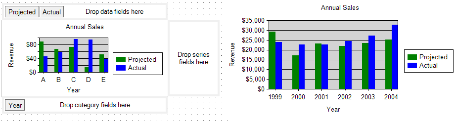
In some scenarios the number of series and their labels are fixed at design time. This is known as static series. In the example below two fields have been dropped in the data fields area. Their labels appear in the legend area (at design time also), and the values of these two fields appear as two series. Notice that in the case of static series, no fields need be dropped in the series fields area.
When more than one field is dropped in the data fields area their values are displayed as multiple static series.
Download sample app with static series.
In some scenarios the number of series and their labels are supplied by the values of a field. This is known as dynamic series. In this case the field that supplies the series labels must be dropped to the series fields area.
In the example below, the SalesPerson field supplies the series labels. We have used a stacked bar chart in this example, so the series are stacked on top of each other instead of appearing side by side.
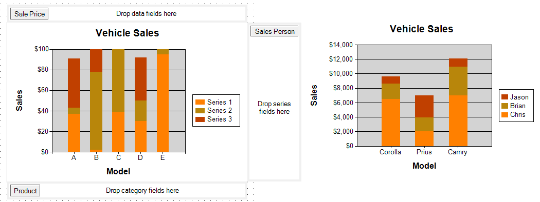
In the sample app, the Product and SalesPerson fields have repeating data. The chart automatically groups data by Product and by SalesPerson, sums up the values in each group and displays summarized data in the chart.
Download sample app.